Such simple placements of the camera and subtle uses of the glass really convey a strong message of the status the two characters have against one another.
Although it sounds like an obvious thing to do, I'd never considered using it myself.
Based on Grit's battle between Sean and Archie, now's as good a time as any to implement this technique into film.
So the film begins with Sean (or more accurately, the delusional side of Archie) in control of his world. Everything is fine. Once Archie appears things change, as Archie gradually gains more and more control of the world and is slowly winning, the camera angles change.
When they meet for the first time the camera angles are level, to show that they are on the same level in terms of how much they know about each other. When they are inside Perry's house and Archie takes control of the situation, the camera puts him higher than Sean.
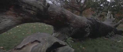
The following scene where Sean and Zoe meet up with Archie uses a visual sign to show his dominance:
The trio meet up at this fallen tree and Archie sits on top of it whilst the other two stand beside. This is a subliminal suggestion to show Archie's control of the world as they discuss Perry's disappearance as he is physically higher up than they are.
When Sean and Zoe meet Trigg the camera initially places them level, as Trigg tells them where he found the wallet the angle shifts to put Trigg in a more dominant position. Once it's revealed that it wasn't Perry's wallet the camera favours towards Sean as he's regained control of his world.
The next scene has a ransom note come through the letterbox. There an over-the-shoulder shot as Sean reads it: this is predominantly to allow the audience to read the letter but it also shows that the camera is looking down at Sean. He's vulnerable. When Sean and Zoe arrive at the location Zoe is standing whilst Sean is seated: again suggesting vulnerability, especially when the argument between them happens.
The Snorricam sequence will have the camera looking slightly up, giving the impression of Sean being dominant but in fact he's confident because he's drinking.
When Archie comes over after Perry's body has been found the hierarchy chafes briefly: Sean takes on the dominant role as he shouts at Archie and the camera follows suit, looking up at Sean as he stands in front of Archie. Archie is sat down in the centre of the sofa, seemingly taking the submissive role but his body language suggests that he is calm and the more reasonable of the two. When Archie shouts back he stands up and the camera looks slightly down at Sean: Archie has reclaimed the control.
In the final scene where Sean and Archie confront each other the dominant camera angle switches between the two of them. The final shot of Sean moving his face very close to Archie's suggests Sean has the dominance. The camera supports this by tilting very slightly to the right to 'raise' Sean higher than Archie as he kills him.
 |
| Sean and Archie face-to-face |
 |
| Roughly what the same shot would look like if tilted |
There is a second idea I have:
Sean is 6 feet tall, Archie is 5 foot 8: a difference of 4 inches. This is a noticeable difference when the characters are together. My idea is to gradually 'shrink' Sean so that by the finale he's the same height as Archie: a hint towards the fact they're the same person.
My solution for this is to cast an actor who is actually 5'8" as Sean and raise his height with heeled shoes; perspective tricks and taking advantage of MCU's and CU's when he's beside other actors.
An example of forced perspective I can think of is in The Lord of The Rings when Gandalf sits down with Frodo. They were in fact several feet apart parallel to one another and pretended to look where the characters would actually be to create the illusion of them being face to face.
The level of extremes the crew went to, to create this effect are beyond our budget so my plan would be to use MCU's and CU's on Sean and have him stand on an object to raise him to the desired height.
Sean would start the film at 6 feet and shrink to 5 foot 8 to show the aspects of reality seeping through. Just like the personality traits of the TP come through: Sean is gradually transforming back into Archie.
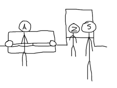
One shot inside Perry's house has Sean, Archie and Zoe in a long shot: showing their full heights in relation to one another. To make Sean look taller I will put him in the foreground and move Archie further to the background as shown in a mock-up illustration I've made:
This will create the effect that Sean is taller than the other two just by him being closer. The audience shouldn't notice that Sean is closer to the camera as it will have already been established that he's taller than the others and therefore assume he's taller in this shot.
I will conduct a test mimicking this to see if the technique works.


No comments:
Post a Comment